A complete route from a finished paper to a printed conference poster: settling the size, the type sizes that survive a crowded hall, five layout patterns, and the printing checks worth running before you pay. Written for the fortnight before a deadline, not for a free afternoon.
Most poster advice online was written for a world where you started with a blank PowerPoint slide and three free evenings. This guide assumes what is actually true: you have a finished paper, a conference deadline, and less time than you would like.
Quick answer
A0 portrait (841 × 1189 mm) at most European and international conferences; 48 × 36 inches landscape is the US standard. Check the call for posters before you design anything.
300–800 words across the whole poster. Body text never below 24 pt, and readable from about three meters.
Whitespace
Around 40% of the surface. It is what makes a dense study scannable.
Structure
One finding stated in the title, results in the largest panel, and a reading path the viewer never has to think about.
4–8 hours building it by hand, or about two minutes for a first draft from your paper PDF.
What a research poster is for
A research poster is a large-format visual summary of one study, presented at a conference poster session. It is not a printed version of your paper, and the single most common mistake is treating it like one.
The poster's job is to start a conversation. Most attendees give a poster less than 90 seconds before deciding whether to stop and talk to you. Everything below follows from that one constraint: if a design choice does not help a stranger decide within 90 seconds, it is costing you.
Step 1 — Settle the size before you design anything
Poster dimensions are set by the conference, not by you. Building a portrait poster and arriving to find a landscape board is an expensive thing to discover on site.
| Format | Dimensions | Typical use |
|---|---|---|
| A0 portrait | 841 × 1189 mm (33.1 × 46.8 in) | Standard at most European and international conferences |
| A1 portrait | 594 × 841 mm (23.4 × 33.1 in) | Student symposia and department poster days |
| 48 × 36 in landscape | 122 × 91 cm | The classic US conference format |
| 36 × 48 in portrait | 91 × 122 cm | US venues with vertical boards |
| Digital / e-poster | 16:9, e.g. 1920 × 1080 px | Virtual conferences and e-poster screens |
For print, design at final size and export at 300 DPI. An A0 poster at 300 DPI is roughly 9933 × 14043 pixels — which is why a figure that looked fine in your manuscript can fall apart when it is blown up to fill a quarter of a wall.
Step 2 — Typography that survives a crowded hall
The test that matters is whether your body text is readable from about three meters. These are the point sizes university poster guides converge on, given for the two most common paper sizes:
| Element | A0 (841 × 1189 mm) | A1 (594 × 841 mm) |
|---|---|---|
| Title | 85–120 pt, bold | 70–90 pt, bold |
| Authors & affiliations | 54–60 pt | 40–48 pt |
| Section headings | 36–44 pt | 32–40 pt |
| Body text | 24–32 pt (never below 24) | 24–28 pt |
| Captions & references | 18–20 pt | 18 pt |
Three rules that matter as much as the numbers. Keep body text to roughly 50–60 characters per line, because wider lines are hard to track from a distance. Use one sans-serif family throughout, or at most two families total. And when your text does not fit, cut words — shrinking the type below 24 pt has never once been the right answer.
These ranges are cross-checked against poster guides from Thompson Rivers University, NYU and Western Carolina University.
Step 3 — Pick a layout from your evidence
Five arrangements cover almost every conference poster. Choose by what your evidence looks like, not by taste.
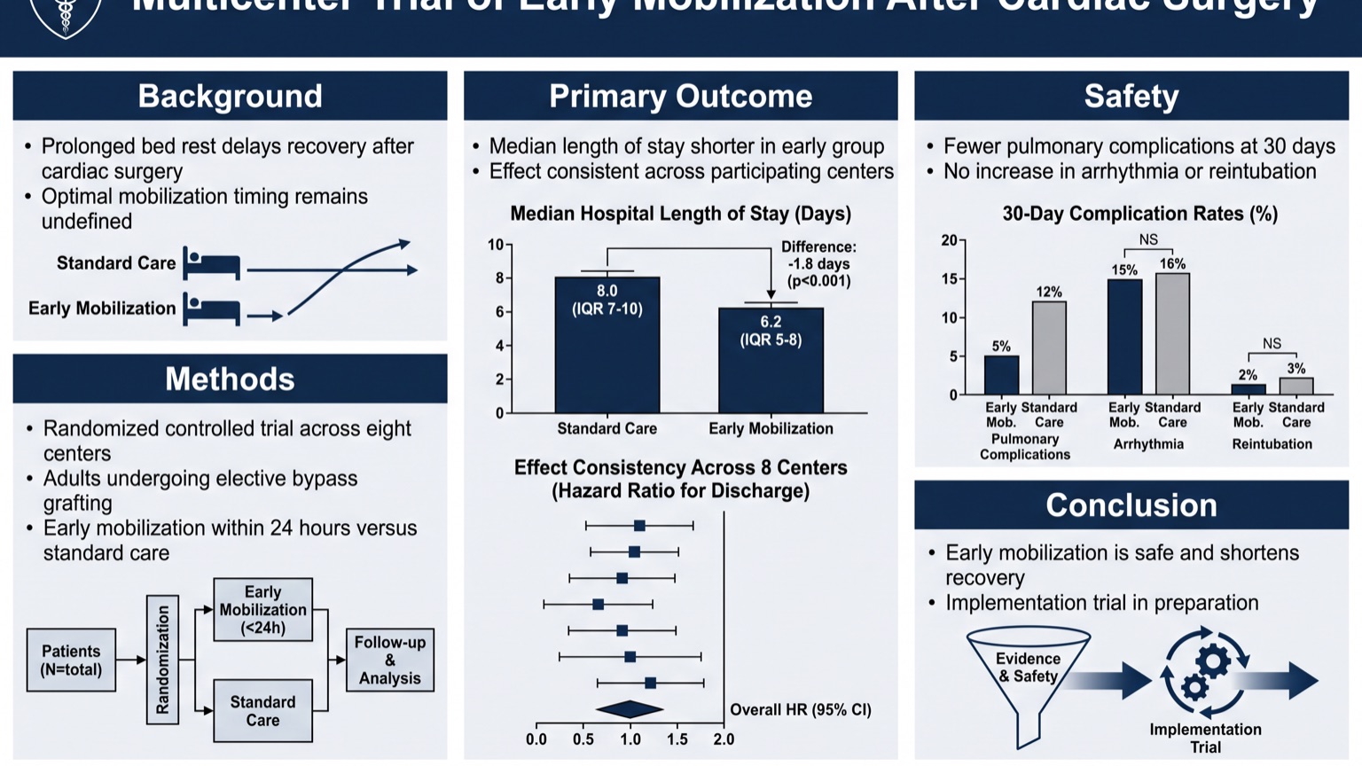
Three-column classic
Introduction and methods left, results center, discussion and references right. It is the default for a reason: every reader already knows how to navigate it. Use it when you have several figures of comparable weight. Note that landscape boards need five or six sections to fill three wide columns, where the same study in portrait runs four.
Figure-dominant
One large central visual — a map, a micrograph, an architecture diagram — with short text blocks arranged around it. Use it when a single image genuinely carries the finding, which is more often than most people admit.
Modular grid
Equal-sized cards read left to right, top to bottom. Suits multi-experiment studies where no single result dominates, and it degrades gracefully when a co-author asks you to cut a panel the night before printing.
Narrative single-column
One wide reading path top to bottom, closer to a magazine spread than a data panel. Best for review work, methods papers and outreach — and it is the pattern that still reads on a phone screen.
Better Poster (billboard)
A design popularised by Mike Morrison in 2019: the main finding is set as one enormous sentence across the middle of the poster, with methods and detail demoted to a narrow sidebar and a QR code pointing at the full paper. It is polarising — some conferences love it, some reviewers read it as under-serious — so check the culture of your venue before committing. Where it genuinely wins is a crowded hall: the finding is legible from across the room, which no conventional layout achieves.
You can see the first four patterns applied to real studies in our scientific poster examples, where each poster comes with a breakdown of why its layout works.
Step 4 — Write the sections
Rough word budget for a poster that lands in the 300–800 range:
- Title — one line, stating the finding rather than the topic. "X reduces Y by 40% in mice" tells a passing reader whether to stop; "Effects of X on Y" tells them nothing.
- Introduction — 2–3 bullets. Why this question matters, and what was unknown.
- Methods — 2–4 bullets plus a diagram if the design is not obvious. Nobody stops at a poster because of the methods, but reviewers check them.
- Results — the largest panel, carrying your strongest figures. This is the only section that should feel generous.
- Conclusion — 2–3 bullets, plus one banner sentence with the takeaway, placed where eyes land first.
- References — the minimum that is honest, at 18–20 pt.
Step 5 — Rebuild your figures, do not paste them
Journal figures are sized for a 90 mm column and read at 30 cm. Blown up to poster scale, their axis labels and legends become illegible even though the image itself is sharp. Rebuild each figure with poster-scale type: axis labels around 24 pt, and legends large enough to read at the same distance as your body text.
While you are in there, check resolution. A 72 DPI screenshot that looks crisp on your laptop will print as visible mosaic at A0. Vector sources (PDF, EPS, SVG) scale losslessly and are always the safer choice.
Step 6 — The printing checklist
The part that gets skipped, and the part that ruins posters at the last minute.
- Resolution — export at 300 DPI at final size. Check by zooming to 100% and reading the smallest caption.
- Bleed — add 3–5 mm if your printer asks for it; ask before exporting, not after.
- Color — printers work in CMYK, screens in RGB. Saturated blues and greens shift most. If the exact color matters, ask for a small proof strip.
- Dark backgrounds — they look striking in a bright hall, but consume far more ink and can band or streak on some large-format printers. Proof a small section before committing to a full A0 run.
- Paper — matte resists glare under conference lighting; glossy photographs better but reflects spotlights into your audience's eyes.
- Lead time — university print shops routinely need 2–3 working days in conference season. Build that into your deadline, not around it.
- Transport — a cardboard tube, or fabric if the conference allows it. Fabric posters fold into hand luggage and survive being sat on.
Step 7 — Building it: by hand or from your paper
The traditional route
PowerPoint with an academic template, Illustrator, or LaTeX with beamerposter.
You set the page size, build a grid, paste in text section by section, place
figures, then fight the alignment until it looks intentional. Full control, and
realistically 4–8 hours for a first draft — plus another round every time your
PI comes back with comments.
Starting from the paper you already have
The work in that traditional route is almost entirely re-typing and re-laying-out material that already exists in your manuscript. An AI scientific poster maker removes that step: upload the paper PDF or paste your abstract, pick a template, and it extracts your title, sections and key findings and lays them out to poster conventions in about two minutes.
Two things worth knowing about this approach. The text on the poster is extracted from your source, not invented — which is the whole reason it can be used for real research rather than mockups. And the draft is a starting point, not a finished poster: expect to adjust emphasis, swap in your own figures and regenerate once or twice, which still puts you well under fifteen minutes.
If you would rather start from a layout and fill it in, the scientific poster templates gallery has six academic styles mapped to fields and venues.
Common mistakes
- Pasting the paper onto the board. Full paragraphs from your discussion section guarantee that nobody reads any of it.
- Body text below 24 pt. It forces readers to step in close, which they will not do in a crowded hall.
- A title that names a topic instead of a finding. You get one line; use it to say what you found.
- Figures lifted straight from the paper. See step 5.
- Five colors and three typefaces. Every extra variation asks the reader to work out what it means. One accent family reads as deliberate.
- No whitespace. Filling every square centimeter is the instinct of someone worried their work looks thin, and it produces exactly the opposite impression.
Frequently asked questions
How long does it take to make a research poster?
Building one by hand in PowerPoint or Illustrator takes 4–8 hours for a first draft, plus revision rounds. Generating a draft from a finished paper takes about two minutes, and most people spend another ten minutes adjusting it.
What size should a research poster be?
A0 portrait (841 × 1189 mm) at most European and international conferences, 48 × 36 inches landscape in the US. Always confirm against the conference's call for posters — the board decides, not you.
How many words should a research poster have?
Between 300 and 800 across the whole poster. Posters that fail usually carry two or three times that.
What font size should a research poster use?
On A0: title 85–120 pt bold, authors 54–60 pt, section headings 36–44 pt, body text 24–32 pt and never below 24, captions 18–20 pt. The real test is readability from about three meters.
Should I use PowerPoint or something else?
PowerPoint is fine and remains the most common tool, mainly because everyone has it and your co-authors can open your file. Its weakness is that its templates know nothing about academic poster conventions, so the layout discipline is entirely on you.
What is the Better Poster format?
A layout that puts the main finding in one very large sentence across the center of the poster, with supporting detail in a sidebar and a QR code to the paper. It is excellent for legibility at a distance and divisive among reviewers — check your venue's culture first.
Do I need a graphical abstract too?
Different artefact, different purpose: a poster presents a study at a conference, while a graphical abstract summarises a paper in a journal table of contents. Many researchers need both, and the underlying content overlaps enough that making one usually makes the other easier. The constraints do not transfer, though: publishers set their own pixel sizes and forbid reusing a paper figure, which our graphical abstract requirements guide goes through publisher by publisher.
Where to go next
- Scientific poster examples — twelve posters across disciplines, each with a breakdown of its layout
- Scientific poster templates — six academic styles mapped to fields and venues
- Scientific poster maker — build a conference-ready draft from your paper PDF
- Graphical abstract guide — journal size requirements and how to make one