Most figure advice is taste dressed up as rules. This is the part that is actually written down: what PLOS, Nature and Elsevier specify, where they disagree, and the handful of decisions that determine whether your figure survives reduction to a single column.
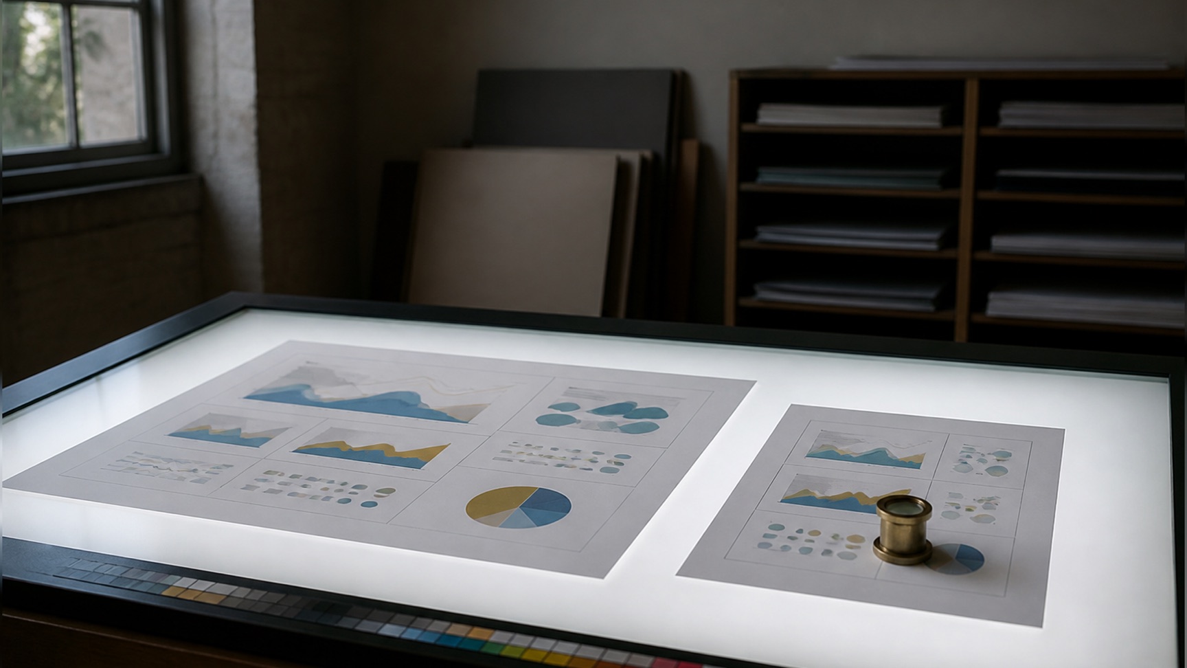
A figure fails in production for a small number of reasons, and none of them are aesthetic. It was drawn at double-column width and printed at single. The lettering was 4 pt after reduction. The chart was pasted in as a screenshot at 72 dpi. The colour scale collapsed to two indistinguishable greys in the printed issue.
Each of those is a decision made before any data was plotted, and each is covered by a published specification you can read. This guide works through those decisions in the order you actually make them, using what PLOS, Nature and Elsevier state in their own author documents.
Scientific figure specifications at a glance
Three publishers, three sets of numbers, all current as of August 2026.
| Specification | PLOS | Nature | Elsevier |
|---|---|---|---|
| Single-column width | 6.68 cm minimum | 89 mm | 90 mm |
| Intermediate width | — | 120–136 mm | 140 mm (1.5 column) |
| Full width | 19.05 cm maximum | 183 mm | 190 mm |
| Maximum height | 22.23 cm | 247 mm (full page) | — |
| Resolution | 300–600 dpi | 300–600 dpi (photographic) | 300 halftone / 500 combination / 1000 line art |
| Lettering size | 8–12 pt | 5 pt minimum, 7 pt maximum, 8 pt bold panel labels | 7 pt normal, 6 pt minimum for sub/superscript |
| Permitted fonts | Arial, Times or Symbol only | Sans-serif, preferably Helvetica or Arial | Arial (or Helvetica), Courier, Symbol, Times |
| File formats | TIFF or EPS only | PSD, TIFF, AI, EPS, PDF | EPS, PDF, TIFF, JPEG |
| File size limit | Under 10 MB | Under 10 MB (Extended Data) | — |
| Colour space | — | RGB recommended, CMYK accepted | — |
Read down the rows rather than across them. The disagreements are small in absolute terms and large in consequence: a figure built to Nature’s 5 pt minimum is below the floor PLOS will accept, and a figure that uses Calibri is outside all three lists.
Start from the column width, not from your screen
The first number to fix is the width the figure will be printed at, because every other specification is downstream of it. Type size, line weight and resolution are all stated at final size, which means they are only meaningful once you know what final size is.
The three publishers state it differently. Elsevier gives four target widths: 30 mm minimum, 90 mm single column, 140 mm for 1.5 columns and 190 mm double column, and publishes the pixel dimensions each implies — 1063 pixels for a 90 mm figure at 300 dpi, 2244 for a 190 mm one. Nature’s final-submission page gives 89 mm single column and 183 mm double column, with a column-and-a-half option of 120–136 mm and a full page depth of 247 mm. PLOS states a minimum width of 6.68 cm, a maximum of 19.05 cm and a height ceiling of 22.23 cm, and adds a tip that is easy to miss: to align a figure with the text column of the PDF, keep it no wider than 5.2 inches, or 13.2 cm.
The failure mode is drawing at whatever width the software opened with, then letting the journal scale it down at layout.
Nature gives the check for this explicitly, and it predates the software: look at the figure at the smallest size it might be printed and confirm that lettering remains readable and that lines are heavy enough to print clearly. The modern version is to place the artwork in a document at exactly 89 or 90 mm, print it on paper, and look at it. Screens flatter figures. Paper does not.
Where a journal states nothing, the publisher-level document usually governs. That is worth checking rather than assuming — our Scientific Reports figure requirements guide walks through a title that publishes no width, no resolution and no point size of its own, and what actually binds you in that case.
What resolution do figures for scientific papers need?
Resolution is only defined at a physical size. Elsevier states the relationship as an equation on its artwork sizing page: pixels equal resolution in dpi multiplied by print size in inches. A 90 mm figure at 300 dpi is 1063 pixels wide. The same 1063-pixel file placed at 190 mm is a 142 dpi figure, and no setting in any application changes that.
The three publishers set different targets because they are describing different content:
- Elsevier asks for 300 dpi for halftone images, 500 dpi for combination art, and 1000 dpi for line art. Line art gets the highest number because a hard black-on-white edge is where sampling artefacts are most visible.
- PLOS asks for 300–600 dpi and warns in both directions. Below 300 the published figure is blurred, jagged or pixelated. Above 600 PLOS may resize the figure. It also caps files at 10 MB.
- Nature asks for a minimum of 300 dpi at the maximum size the image will be used, with 300–600 dpi for photographic images in PSD or TIFF.
Two warnings appear almost verbatim in more than one of these documents, which is a reasonable signal that they are the errors production staff see most.
The first: increasing resolution in software does not improve quality. Nature states that artificially increasing an image’s resolution in an artwork program will not improve it. PLOS states that a low-resolution figure cannot be improved by increasing the resolution in graphics software and that the only remedy is to re-create the figure. PLOS goes further and frames upsampling a micrograph as a data-integrity problem, not a technical one: adding pixels that were not in the original means the computer is creating data that was never measured, and the result misrepresents the original.
The second: a composite figure inherits the resolution of its worst element. PLOS puts it plainly — the quality of your figure is only as good as the lowest-resolution element in it, and a 72 dpi line graph placed inside a 300 dpi TIFF is still a 72 dpi line graph. This is why a screenshot dropped into an otherwise clean panel is visible in the printed issue. PLOS also flags the mechanism people trip over in presentation software: use the Insert tool to place a figure, because dragging, dropping, copying or pasting produces a 72 dpi image.
Vector or raster? Decide per element, not per figure
Raster formats store a grid of pixels and have a fixed resolution. Vector formats store the shapes themselves and render at whatever resolution the output device has. The consequence is that vector artwork has no dpi at all — asking for a 600 dpi EPS of a line chart is a category error.
Which one you need is decided by how the content came into existence, not by what kind of figure it is:
- Drawn content is vector. Charts, graphs, plots, schematics, pathway diagrams, flow charts and every piece of lettering. Nature asks authors not to rasterize line art or text and to supply editable, unflattened vector artwork wherever possible, naming Adobe Illustrator, PostScript, vector EPS or PDF for figures containing line drawings and graphs. Elsevier names EPS as its preferred format for vector graphics.
- Captured content is raster. Photographs, micrographs, gels, blots, scans and anything from a detector. Nature asks for layered PSD or TIFF at 300–600 dpi and specifically asks for the Photoshop file with its layers intact when labels or arrows sit over an image, so those can still be edited at production.
Most real figures are both, and the correct structure is a vector container holding raster panels at full resolution — an Illustrator or Inkscape document with the micrograph placed inside it and every label, arrow and scale bar drawn as live vector on top. Elsevier calls this combination art and asks for 500 dpi when the whole thing has to be flattened to raster.
Two production details that cause avoidable delays. Elsevier asks that fonts be embedded when exporting EPS and warns that non-standard fonts may be substituted with an Elsevier standard font, which produces missing symbols or overlapping type. PLOS asks for fonts to be embedded or converted to outlines in EPS files, and notes that files from environments like MATLAB should be opened in Illustrator or Inkscape and have their text converted to outlines — with the caveat that outlined text can no longer be edited, so it is the last step, not the first.
What type size and line weight survive reduction
These are the two specifications most often quoted from memory and most often wrong, because both are stated at final printed size.
Line weights. Nature states the range directly: line weights and strokes should be set between 0.25 and 1 pt at final size, and lines thinner than 0.25 pt may vanish in print. It also asks that these lines not be rasterized or outlined if it can be avoided, so that production can adjust them. Neither PLOS nor Elsevier publishes an equivalent number, which makes Nature’s the one to design to when you have no other guidance.
Type sizes, where the three publishers genuinely disagree:
| Publisher | Minimum | Maximum | Panel labels | Source |
|---|---|---|---|---|
| Nature | 5 pt | 7 pt | 8 pt bold, upright a, b, c | Final submission page |
| Elsevier | 6 pt (sub/superscript) | about 10 pt where tints demand it | — | Artwork sizing |
| PLOS | 8 pt | 12 pt | — | Figures page |
Elsevier’s wording is worth reading carefully, because it is the only one of the three that admits its number is provisional. Its rule of thumb is a finished printed size of 7 pt for normal text and no smaller than 6 pt for subscripts and superscripts, but it says outright that this is a rule of thumb rather than a strict rule, and that other factors in the artwork — tints and shadings — can dictate a finished size of perhaps 10 pt.
Under all three sits the same requirement, and ICMJE states it as a principle rather than a number: letters, numbers and symbols on figures should be clear and consistent throughout and large enough to remain legible when the figure is reduced for publication. ICMJE adds a consequence most authors forget — many journals do not redraw figures, and many published figures go straight into slide presentations, so the figure has to stand on its own at both sizes.
One rule is shared and absolute. Nature asks that lettering be the same font throughout all figures in a paper. Elsevier states that inconsistent sizing across an article is what its artwork guidance is trying to prevent. Two figures set in different faces read as two different papers.
Colour that survives print and colour-vision deficiency
Colour is where a figure most often stops being a neutral record of the data, and it is the one area where the strongest source is not a publisher.
Crameri, Shephard and Heron, writing in Nature Communications in 2020, put two numbers on the problem. Around 0.5% of women and 8% of men have a colour-vision deficiency worldwide. And a colour map that distorts data through uneven lightness gradients can make a reader’s visual interpretation diverge from the data by more than seven percent of the displayed variation — a systematic error introduced entirely by the choice of palette.
The mechanism is lightness. A perceptually uniform colour map changes brightness at a constant rate along its range, so equal steps in the data look like equal steps to the eye and the ordering survives conversion to greyscale. Rainbow-like maps do not.
What to do with this in practice:
- Use a perceptually uniform sequential map for continuous data. These ship with every modern plotting library. Crameri and colleagues also publish a set of scientific colour maps designed for the purpose.
- Never encode a variable in red against green alone. That is the most common form of colour-vision deficiency, and the pairing is common in fluorescence overlays. Magenta and green is the usual substitute and costs nothing.
- Give every colour a second channel. Different line styles, marker shapes or direct labels mean the figure still reads when colour fails — in greyscale, on a projector, or for one reader in twelve.
- Check the greyscale conversion before submission, not because journals still print in black and white as a rule, but because it is the fastest test of whether your palette encodes order at all.
Nature adds the production side of the same question. Colour artwork can be supplied in RGB or CMYK, and Nature recommends RGB because it has a wider gamut and reproduces fluorescent colours more faithfully on screen. The catch is stated in the same paragraph: RGB figures are automatically converted to CMYK for print, the CMYK range is narrower, brighter colours are likely to appear muted, and contrast between coloured areas may be reduced. If faithful printed colour matters more than screen colour, Nature suggests converting to CMYK yourself before submitting, so you see what the conversion does while you can still fix it.
How to write a figure legend
A legend is not a caption you write at the end. It is the part of the figure a reader uses when they have not read the paper, which for most readers is always.
PLOS specifies the structure precisely. A caption has two required elements: a label and a title. The label uses Arabic numerals with “Figure” abbreviated to “Fig”. The title must be concise and descriptive and restricted to 15 words or fewer. The legend goes directly after the title, and any figure credits go in its last sentence. Legends themselves are optional at PLOS in the formal sense — the label and title are not.
That is PLOS. Eight other bodies set their own requirements and they do not agree: Nature caps the legend at 300 words, PNAS wants the sample size inside it, and APA uses the word for something else entirely. Our guide to writing a figure legend puts all nine side by side.
The content rules come from PLOS and ICMJE together, and they converge:
- Make the figure self-explanatory. PLOS asks for a description that lets readers understand the figure without referring to the text. ICMJE asks that figures be made as self-explanatory as possible, precisely because so many are reused directly in slide presentations.
- Describe each panel by its lettered label — (A), (B) — rather than writing one continuous paragraph about the figure as a whole.
- Define every non-standard symbol and abbreviation. ICMJE extends this to anything used to identify parts of the illustration: symbols, arrows, numbers and letters must each be identified and explained in the legend.
- Be succinct and do not restate the methods. PLOS asks explicitly for short legends without lengthy method descriptions.
- Put titles and explanations in the legend, not on the image. ICMJE states this directly. PLOS reinforces it from the file side: do not include author names, article title or figure number, title or caption inside the figure files.
Two placement rules that submission systems check. PLOS asks for captions in the manuscript text, in read order, immediately after the paragraph where the figure is first cited — not inside the image files and not in a separate document. ICMJE, writing for medical journals, asks for legends on a separate page with Arabic numerals matching the illustrations. Follow the target journal, and note that the two conventions are mutually exclusive.
Three more from ICMJE that apply to specific content types. Photomicrographs need internal scale markers, and any symbol, arrow or letter on them must contrast with the background. The internal scale must be explained and the staining method identified. And a previously published figure requires acknowledgement of the original source plus written permission from the copyright holder, regardless of whether you were an author on it, unless the document is in the public domain.
How to number and cite figures in the text
Mechanical, but it is where copy-editing queries come from.
Figures are numbered consecutively in the order of first citation in the text — ICMJE and PLOS both state this. PLOS adds that the count includes text boxes and tables, and that in the published article figures are placed according to where their first citation and caption appear.
PLOS also states one flexibility worth knowing. Lettered subparts may be cited in any order, as long as the first mention of each whole figure is in numerical order: you can cite Fig 3C before Fig 3A, provided Figs 1 and 2 have already appeared. In-text citations take the form Fig 1A, Fig 1B, Fig 2.
Three strings have to agree — file name, caption label and in-text citation.
PLOS asks that a file named Fig1.tif match the citation Fig 1 and the label
Fig 1. in the caption, that files be named in numeric order, and that each be
uploaded as a separate file rather than embedded in the manuscript. If you
renumber during revision, all three have to be updated together.
References cited only inside a figure legend are numbered by the sequence established by the first mention of that figure in the text, not by where they fall in the reference list. That is ICMJE, and it is the rule that most often produces an out-of-order reference list after revision.
Which software to use, and what each one is for
PLOS is unusually direct here, naming tools on its own figures page: Adobe Illustrator or Inkscape, which is free, for assembling vector figures, and GIMP, OpenOffice or LaTeX for raster work. It is equally direct about the limit — PLOS does not provide graphics services, and the preparation and final quality of figures is the author’s responsibility.
That splits the work into three stages, and the mistake is trying to do all three in one application.
Plotting belongs in the environment the analysis lives in — R, Python, MATLAB, or whatever produced the numbers. The reason is not quality. It is that data changes during review, and a plot generated by a script regenerates in seconds while a plot redrawn by hand costs an evening every time. Export as vector: PDF or EPS, never PNG.
Assembly belongs in a vector editor. Illustrator and Inkscape do the same job. Illustrator writes AI and EPS natively, which is exactly what Nature and Elsevier ask for; Inkscape is free, writes SVG by default and needs an explicit export to EPS or PDF. PLOS accepts EPS but notes that EPS files frequently arrive with missing or corrupted fonts, oversized masks and stray points, and recommends TIFF as the easier format to work with — so if you assemble in vector, check the export rather than trusting it.
Image handling — cropping micrographs, assembling blot panels — belongs in an image editor with a documented history. PLOS asks for original blot and gel images to be compiled into a single PDF or an LZW-compressed TIFF, and specifically advises against compiling them in PowerPoint because resolution is lost.
Presentation software occupies an awkward middle. PLOS permits building multi-panel figures in PowerPoint, Impress or Keynote and converting to TIFF, and gives the settings for doing it without losing resolution. It works. It also produces a file nobody can edit at production, which is the opposite of what Nature asks for.
The category that has grown fastest is dedicated scientific illustration — tools that supply publication-ready biological and clinical elements so you are not drawing a mitochondrion from scratch. We compare the options, licensing included, in our guide to BioRender alternatives. The licence matters more than the drawing tools: a figure you cannot legally publish is not a figure.
Some figure types have a governing standard rather than a house style, and for those the layout is not yours to choose. A systematic review’s flow diagram is specified box by box — our PRISMA flow diagram guide covers what each box must contain and where the counts come from.
What counts as image manipulation
The line is not intuitive, and getting it wrong is a retraction rather than a revision.
The scale of the problem is documented. Bik, Casadevall and Fang examined 20,621 papers containing the term “Western blot” across 40 journals and 14 publishers, published between 2005 and 2014, requiring consensus between three independent examiners before classifying an image as problematic. They found that 3.8% of published papers contained problematic figures, with at least half showing features suggestive of deliberate manipulation. Their own reading of that number is that it understates the total, since it covers one type of data only.
PLOS states the operating rules, and they are more specific than “do not alter your data”:
- Adjustments must be applied to the whole image, and must not obscure, eliminate or misrepresent anything present in the original.
- The background must keep the noise it originally had. PLOS states that the background should not appear as one uniform colour, and that cleaning it up with a rubber stamp or wipe tool to improve appearance, or over-adjusting brightness and contrast until the background disappears, is not acceptable.
- Do not overcrop around the bands of interest. Blot panels should include background area above and below the bands, and any non-specific bands in the original must be shown and explained in the text or the legend.
- Never splice across different blots, exposures or gels within one panel. If data from several images is needed, they must be shown as clearly distinguished separate panels, and the legend must say they come from different gels, blots or exposures.
- Splicing within one original image is permitted, and must be marked. If lanes have been reordered or an irrelevant lane removed, the join must be indicated by a thin white or black line on the figure, and the legend must describe how the figure was made.
ICMJE adds two requirements from the clinical side. Before-and-after images must be taken with the same intensity, direction and colour of light. And because blots serve as primary evidence, editors may require the original photographs to be deposited on the journal’s website — which is the practical argument for keeping unmodified originals from the beginning, filed with the figure rather than somewhere on an old laptop.
A pre-submission figure checklist
Run this against the journal’s own author instructions, which override anything here.
- The figure is drawn at one of the journal’s stated widths, and you have checked which ones it publishes
- Lettering is legible at that width on paper, not on screen
- Type size is inside the journal’s stated range at final size, and the same face is used across every figure in the paper
- Line weights are between 0.25 and 1 pt at final size unless the journal says otherwise
- Drawn elements are vector, captured elements are raster at 300 dpi or better at final size, and nothing has been upsampled
- Fonts are embedded, or outlined as the last step before export
- The colour map is perceptually uniform, and the figure still reads in greyscale
- No red-against-green as the only distinction between two conditions
- The legend has a label, a title within the word limit, a description of every lettered panel, a definition of every symbol and abbreviation, and credits in the last sentence
- Scale bars are present on every micrograph and defined in the legend
- File name, caption label and in-text citation agree, and figures are numbered by order of first citation
- No author names, article title or caption text inside the image file
- Original unmodified images are archived and retrievable
- The file is under the journal’s size limit in an accepted format
Frequently asked questions
What resolution should a scientific figure be? It depends on the content. Elsevier asks for 300 dpi for halftones, 500 dpi for combination art and 1000 dpi for line art. PLOS asks for 300–600 dpi and warns that above 600 it may resize the figure. Nature asks for 300–600 dpi for photographic images. In all three cases the number applies to the file at its final printed size, and raising it after the fact adds nothing.
What size should a figure be for a scientific paper? Design to the journal’s column width. Elsevier: 90 mm single, 140 mm at 1.5 columns, 190 mm double, 30 mm minimum. Nature: 89 mm single, 183 mm double, 120–136 mm for a column-and-a-half, 247 mm page depth. PLOS: 6.68 cm minimum width, 19.05 cm maximum, 22.23 cm maximum height. These are not interchangeable.
What font and font size should I use? One sans-serif face across every figure in the paper. Nature: preferably Helvetica or Arial, 5 pt minimum, 7 pt maximum, panel labels 8 pt bold upright a, b, c. Elsevier: Arial or Helvetica, Courier, Symbol or Times, 7 pt finished for normal text and no smaller than 6 pt for sub- and superscripts. PLOS: Arial, Times or Symbol only, 8–12 point. Every size refers to type after reduction.
How do I write a figure legend? Follow the PLOS structure — label, then a title of 15 words or fewer, then the legend, with credits in its last sentence. Describe each lettered panel, define every non-standard symbol and abbreviation, explain any arrow or marker on the illustration, and leave the methods out. The test is whether the figure is understandable without the body text.
Should I use vector or raster format? Vector for anything drawn, raster for anything captured. Nature asks authors not to rasterize line art or text and to supply editable, unflattened vector artwork wherever possible. Elsevier prefers EPS for vector graphics. A mixed figure belongs in a vector container with the photographic panel placed inside at full resolution.
Is it acceptable to adjust brightness and contrast? Only across the whole image, and only where nothing present in the original is obscured or eliminated. PLOS requires that images keep their original background noise and prohibits cleaning the background with a rubber stamp or wipe tool. Splicing is allowed only within a single original image, must be marked with a thin dividing line, and must be described in the legend.
What software should I use? PLOS names Illustrator or Inkscape for vector assembly and GIMP, OpenOffice or LaTeX for raster work. Plot in the environment that holds the data and export as vector, assemble in a vector editor, and keep image handling in an editor that preserves the original.
Where to go next
- Nature’s figure requirements in detail — the full production specification for a Nature submission, including where the formatting guide and the final-submission page state different widths
- Graphical abstract requirements by publisher — a separate specification from the one above, with four publishers asking for four different shapes
- The scientific illustration generator — start a figure at the column width you are submitting to
- AI-generated figures and journal policy — which publishers accept an AI-drafted schematic, which do not, and where the disclosure goes
- Examples gallery — posters, graphical abstracts and illustrations produced against these specifications, if you want to see the output before the rules
参考来源
- PLOS ONE — Figures (submission guidelines) — PLOShttps://journals.plos.org/plosone/s/figures访问日期 2026年8月14日
- Nature — Final submission and figure preparation — Springer Naturehttps://www.nature.com/nature/for-authors/final-submission访问日期 2026年8月14日
- Elsevier — Artwork sizing — Elsevierhttps://www.elsevier.com/about/policies-and-standards/author/artwork-and-media-instructions/artwork-sizing访问日期 2026年8月14日
- Elsevier — Artwork overview (formats and fonts) — Elsevierhttps://www.elsevier.com/about/policies-and-standards/author/artwork-and-media-instructions/artwork-overview访问日期 2026年8月14日
- ICMJE — Preparing a Manuscript for Submission to a Medical Journal — International Committee of Medical Journal Editorshttps://www.icmje.org/recommendations/browse/manuscript-preparation/preparing-for-submission.html访问日期 2026年8月14日
- Crameri, Shephard & Heron (2020), “The misuse of colour in science communication”, Nature Communications 11:5444 — Springer Naturehttps://www.nature.com/articles/s41467-020-19160-7访问日期 2026年8月14日
- Bik, Casadevall & Fang (2016), “The Prevalence of Inappropriate Image Duplication in Biomedical Research Publications”, mBio 7(3) — American Society for Microbiologyhttps://pmc.ncbi.nlm.nih.gov/articles/PMC4941872/访问日期 2026年8月14日
文中出现的期刊、会议及产品名称均为各自权利人的商标。本页为独立编辑内容,与上述机构无隶属、授权或背书关系。规格会变动——投稿或送印前,请以上方官方来源为准逐条核对。