
Scientific Poster Examples
Conference-ready research poster examples across different fields and design styles. Every example comes with a breakdown of why its layout works, plus the typography specs and style choices behind it.
Portrait posters — A0 and 36 × 48 in
Landscape posters — 48 × 36 in
Which poster style fits your field
Style is not decoration — it signals your field and sets expectations before anyone reads your title. This is how the six templates map to research areas, layouts and venues:
| Style | Fits these fields | Layout it favors | Palette | Best venues |
|---|---|---|---|---|
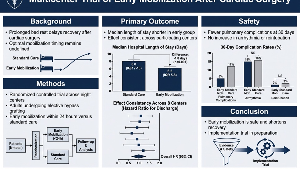
| Classic Navy | Medicine, biology, clinical research | Three equal columns | Navy, slate, white | Traditional and clinical conferences |
| Modern Dark | AI, computer science, quantum physics | Three columns, figure-centered | Near-black, cyan accents | Tech and computational conferences |
| Life Sciences | Ecology, environmental science, plant biology | Two columns, figure-dominant | Forest green, sage, sand | Field science and sustainability meetings |
| Editorial Serif | Neuroscience, public health, interdisciplinary work | Narrative single or double column | Cream, warm amber, charcoal | Review sessions, outreach, translational venues |
| Tech Gradient | Machine learning, bioinformatics, materials | Three columns, modular cards | Blue-violet gradient | Industry-facing and applied conferences |
| Minimal Mono | Theoretical physics, mathematics, methods work | Wide margins, sparse grid | Monochrome, one accent | Design-conscious and theory venues |
Research poster layout patterns
Four arrangements cover almost every conference poster. Pick by what your evidence looks like, not by taste.
Three-column classic
Introduction and methods left, results center, discussion and references right. The default for a reason: every reader already knows how to navigate it. Use it when your work has several figures of comparable weight.
Figure-dominant
One large central visual — a map, a micrograph, an architecture diagram — with short text blocks arranged around it. Use it when a single image genuinely carries the finding, which is more often than most people admit.
Modular grid
Content in equal-sized cards that read left to right, top to bottom. Suits multi-experiment studies where no single result dominates, and it degrades gracefully if you have to cut a panel late.
Narrative single-column
One wide reading path top to bottom, closer to a magazine spread than a data panel. Best for review work, methods papers and outreach — and it is the pattern that survives being read on a phone screen.
Scientific poster font sizes and text limits
Poster text has to be readable from about three meters (10 feet). These are the point sizes university poster guides converge on, given for the two most common paper sizes:
| Element | A0 (841 × 1189 mm) | A1 (594 × 841 mm) |
|---|---|---|
| Title | 85–120 pt, bold | 70–90 pt, bold |
| Authors & affiliations | 54–60 pt | 40–48 pt |
| Section headings | 36–44 pt | 32–40 pt |
| Body text | 24–32 pt (never below 24) | 24–28 pt |
| Captions & references | 18–20 pt | 18 pt |
- Total word count: aim for 300–800 words across the whole poster. Past that, people stop reading and start walking.
- Line length: keep body text to roughly 50–60 characters per line; wider lines are hard to track from a distance.
- Typeface: one sans-serif family throughout, or at most two families total. Sans-serif holds up better at distance than serif for body text.
- Whitespace: around 40% of the surface. It is the single cheapest way to make a dense study look considered.
Ranges cross-checked against poster guides from Thompson Rivers University, NYU and Western Carolina University (August 2026).
Common scientific poster mistakes
Pasting the paper onto the board
The most common failure by a wide margin. A poster is a conversation opener, not a manuscript — if your poster contains full paragraphs of your discussion section, nobody will read any of it.
Body text below 24 pt
At A0, anything under 24 pt forces readers to step in close, which they will not do in a crowded hall. Cutting text is the fix; shrinking type never is.
A title that names a topic instead of a finding
"Effects of X on Y" tells a passing reader nothing. "X reduces Y by 40% in mice" tells them whether to stop. Use the space to state your result.
Figures lifted straight from the paper
Journal figures are sized for a 90 mm column and read at 30 cm. Blown up to poster scale, their axis labels and legends turn illegible — rebuild them with poster-scale type.
Five colors and three typefaces
Every extra color and font asks the reader to work out what the variation means. One accent color family and one type family read as deliberate; more reads as decoration.
No whitespace
Filling every square centimeter is the instinct of someone worried their work looks thin. It produces the opposite effect — dense posters read as unedited, not as thorough.
Scientific poster examples FAQ
What size should a scientific poster be?
A0 portrait (841 × 1189 mm / 33.1 × 46.8 in) is the standard at most European and international conferences, and 48 × 36 inches landscape is the classic US format. Check your conference's call for posters first; A1 (594 × 841 mm) shows up at student symposia and department poster days.
What font size should a research poster use?
On an A0 poster: title 85–120 pt bold, authors 54–60 pt, section headings 36–44 pt, body text 24–32 pt and never below 24 pt, captions 18–20 pt. The test that matters is whether your body text is readable from about three meters.
How many words should a scientific poster have?
A scientific poster should carry 300 to 800 words in total. Most posters that fail do so by carrying two or three times that, which turns a 90-second scan into something nobody attempts.
What makes a good scientific poster?
A good scientific poster states one clear finding in the title, gives results the largest panel, keeps body text readable from three meters, and leaves roughly 40% whitespace. The reading path should be obvious enough that no viewer has to think about it — posters that win prizes are almost always the ones that cut the most.
How do I choose a poster layout?
Let your evidence pick the layout: several comparable figures suit a three-column classic, one commanding visual suits a figure-dominant layout, many equal-weight experiments suit a modular grid, and review or methods work suits a narrative single column. All four are broken down above.
Should a research poster be portrait or landscape?
Build whatever the conference board requires — this is not a design choice. European and international meetings usually specify A0 portrait; US conferences commonly use 48 × 36 inches landscape. Building portrait for a landscape board is an expensive mistake to discover on site.
Can I recreate these examples with my own research?
Yes — every example here was generated with our Scientific Poster Maker. Upload your paper PDF or paste your abstract, pick the same template, and your content is laid out in the same style.
Which poster style should I choose?
Match the style to the field and the venue: classic navy for clinical and conservative meetings, dark or gradient for AI and computational work, life-sciences green for biology and ecology, editorial serif for interdisciplinary and outreach settings, minimal for theory. The table above maps all six.
Are these real AI-generated posters?
Yes — every poster on this page came out of the poster maker using the template shown, with no manual redesign. The text is extracted from source material rather than invented, which is why the sections read as real research.
Where can I find more research poster examples?
University research offices publish large galleries of real conference posters, and they are worth studying for content density. For design patterns you can apply directly, the examples here are each paired with a breakdown of the layout decision behind them.
Keep exploring
Our other diagram tools, and the guides behind them.
Make your own research poster
From abstract to conference-ready poster in a couple of minutes.
Open Poster Maker