
Visual Abstract Maker
Paste your clinical abstract or upload the paper PDF — the AI lays out the population, intervention and outcome panels and carries your effect sizes through exactly as reported.
What is a visual abstract?
A visual abstract is a single image that reports the result of a study in three panels: the population studied, the intervention compared, and the outcome measured. It is a creature of clinical medicine, popularized around 2016 by Andrew Ibrahim at Annals of Surgery, and it spread fast because it solved a specific problem — a randomized trial posted as a bare link gets scrolled past, while the same trial posted as a legible figure gets read.
The important thing about a visual abstract is where it lives. It is made for the journal's social feed, for a slide in a journal club, for the tweet an author sends the morning their paper drops. That changes the design brief completely: it has to be self-contained away from the paper, it has to survive being viewed on a phone, and it has to state the effect size as a number rather than gesture at it with an arrow.
The three-panel structure
Almost every visual abstract you have seen is a variation on the same skeleton. The panels read left to right, each headed by one word, each carrying one icon and one short line of text.
Population
Who was studied, with the n. "1,284 adults with type 2 diabetes" — not "patients with diabetes".
Intervention
What was compared, both arms named. Two icons side by side beat one icon and a caption.
Outcome
The primary endpoint as a number, with direction. "18% vs 27% at 12 months" is the whole point of the figure.
A title bar that states the finding
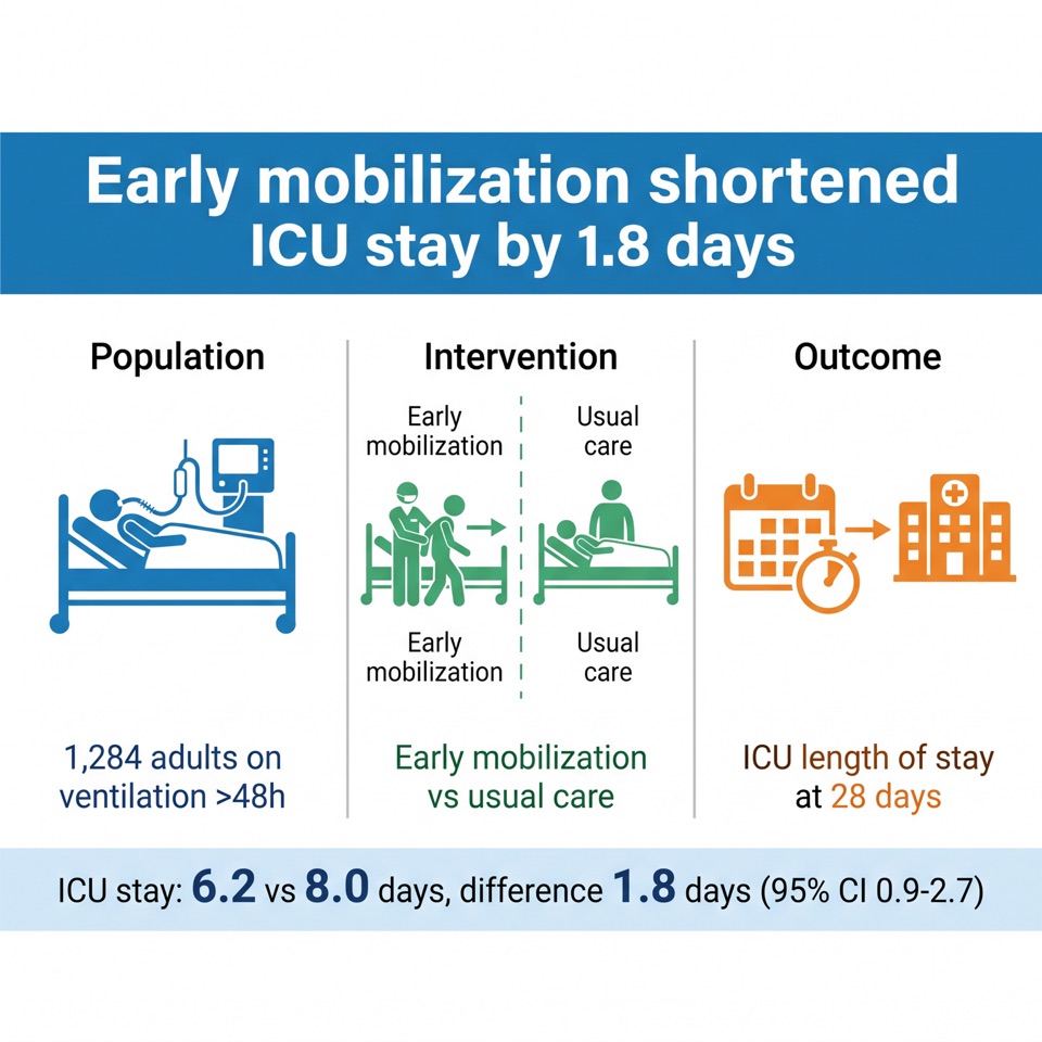
Not the paper's title — the finding. "Early mobilization shortened ICU stay by 1.8 days" tells a scrolling reader whether to stop. The full citation goes in small type at the bottom, so the image is attributable when it travels without the link.
Numbers, not adjectives
A visual abstract that says "significantly improved" has wasted its one advantage over the written abstract. Put the point estimate in, and the comparator next to it.
One icon per panel, no more
Icons orient the eye; they do not carry the argument. Three clean pictograms read faster than a dozen tiny ones, and they stay legible at thumbnail size in a feed.
Honest framing
Relative risk reductions look dramatic and mislead. Report what the paper reports, keep the denominator visible, and do not drop the confidence interval if the result is borderline.
Visual abstract examples
Two made with the tool above, and what to notice in each.
Critical care — a randomized trial
Read the top bar first: it states the effect size, not the topic. "Shortened ICU stay by 1.8 days" gives a scrolling reader something to react to, where "A trial of early mobilization" would give them nothing. Below it each panel carries exactly one idea, and the sample size sits in the population panel rather than crowding the title. The result strip is the only place the two arms appear as numbers — state each figure once and the eye learns where to look for it.
Emergency medicine — time to treatment
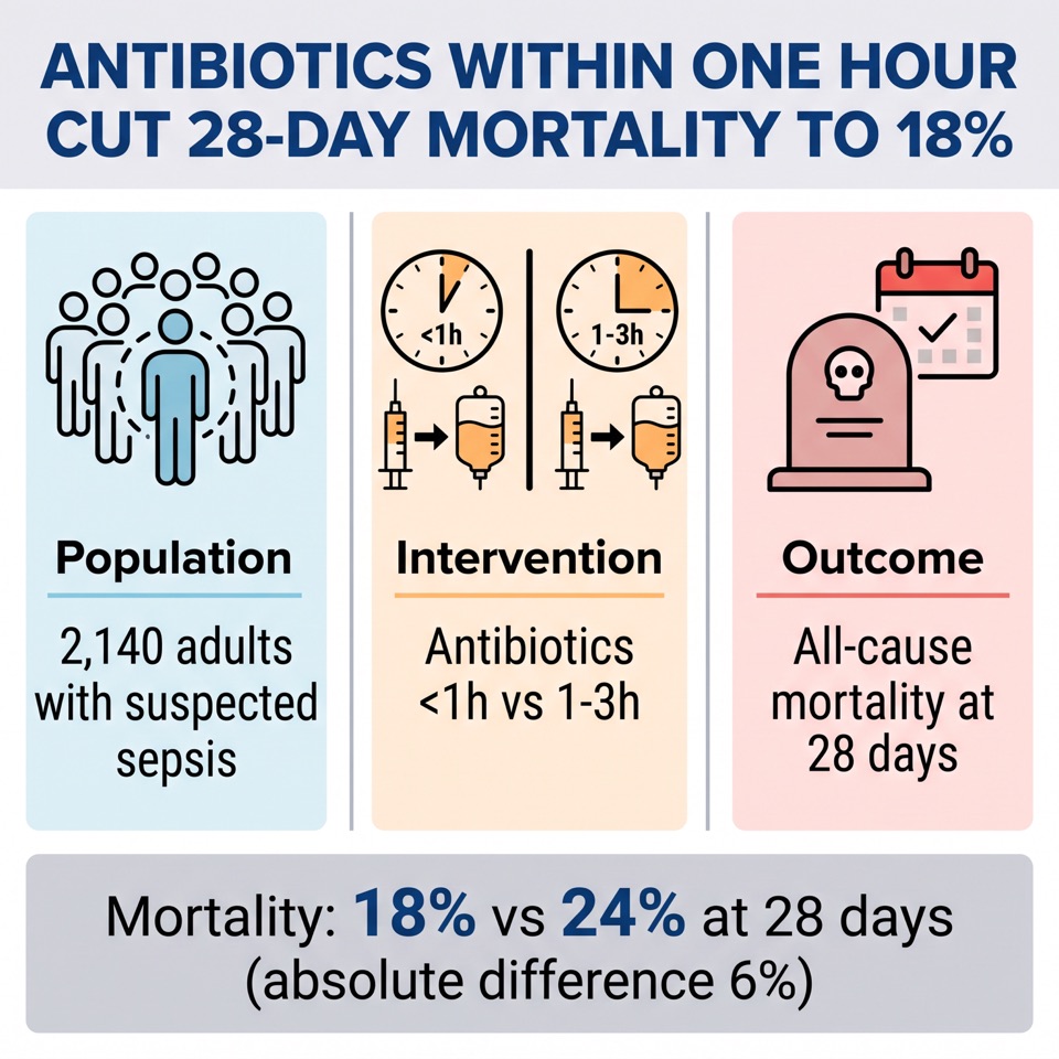
The intervention panel does its work without prose: two clocks, two identical drips, and the comparison is legible before you read a word. Note how the outcome is framed — 18% vs 24%, with the absolute difference spelled out. The relative version, "25% lower mortality", is the same result dressed to look larger, and it is the fastest way for a visual abstract to mislead the people who reshare it.
The studies shown are invented to demonstrate the format. Every number in them is illustrative — none of these trials exist, and nothing here should be cited as evidence.
Visual abstract vs graphical abstract
The two terms get used interchangeably, and they are not the same object. If your target journal asked for one at submission, it almost certainly means a graphical abstract.
| Visual abstract | Graphical abstract | |
|---|---|---|
| Where the term comes from | Clinical medicine — Annals of Surgery, JAMA, BMJ | Publisher language — Elsevier, Cell Press, ACS |
| Structure | Fixed three panels: population, intervention, outcome | Free-form flow: question → method → finding |
| What it shows | Trial results — effect sizes, comparisons | Mechanism — pathways, molecules, experimental system |
| Amount of text | More, and numbers are mandatory | As little as possible, short labels only |
| When it is made | Usually after acceptance, for dissemination | At submission, as part of the manuscript package |
| Size requirements | No formal spec — sized for social feeds | Strict per-publisher pixel specs |
| Typical fields | Clinical trials, systematic reviews, epidemiology | Chemistry, materials, cell and molecular biology |
Usage is not policed. Some journals use both words for the same thing, and plenty of authors submit a three-panel figure as a graphical abstract without anyone objecting. What you must follow is the spec in your journal's guide for authors, not the name.
Graphical abstract maker →Where visual abstracts are used
Visual abstracts are a dissemination format, not a submission requirement, which is why you will rarely find pixel dimensions for them in a guide for authors. These are the journal families where the format is established:
| Journal or family | How it is used |
|---|---|
| Annals of Surgery | Where the modern format originated; house style is the three-panel layout with a bold finding line. |
| JAMA Network | Visual abstracts accompany major trials on article pages and social accounts. |
| BMJ | Used across the group for trials and evidence summaries, often with an infographic variant. |
| Blood / ASH journals | A standard part of promotion for hematology trials. |
| Society journals and conferences | Increasingly requested for accepted abstracts and press releases, usually with a house template. |
Check whether your journal has a house template before you design one. Several supply a PowerPoint file with fixed panel positions, and matching it is easier than arguing with their social editor later.
How to make a visual abstract in 5 steps
- 1
Pull the three numbers first
Your n, your two arms, and your primary endpoint with both values. If you cannot write those on one line, the figure is not ready to be designed yet.
- 2
Write the finding as a sentence
"Early mobilization shortened ICU stay by 1.8 days." That sentence becomes the title bar, and everything below it exists to support that one claim.
- 3
Fill the three panels
Population, intervention, outcome — one heading, one icon and one short line each. Resist adding a fourth panel for methods; that is what the paper is for.
- 4
Generate or draw it
Paste the abstract into the composer at the top of this page — the extraction step is pinned to the three panels, so you get population, intervention and outcome without asking for them. Add instructions only when you want to steer the wording or the icons.
- 5
Check it at phone size
Shrink the image to the width of a phone screen. If the endpoint numbers stop being readable, enlarge them and cut something else — a visual abstract that needs zooming has already lost its audience.
A visual abstract template you can fill
The maker above already lays the three panels out for you. This skeleton is for the rest: steering the exact wording, briefing a designer, or building the figure by hand in PowerPoint. Replace the bracketed parts with your own results — if you paste it into the composer as instructions, your numbers still come through unchanged rather than rounded.
Three-panel visual abstract, panels side by side, equal width.
Title bar at the top: [your finding as one sentence, with the number].
Panel 1 — POPULATION: [n and the population studied].
Panel 2 — INTERVENTION: [arm A] vs [arm B], shown as two parallel icons.
Panel 3 — OUTCOME: [primary endpoint: value A vs value B, timepoint].
Citation line in small type at the bottom: [journal, year].
One simple icon per panel, large sans-serif labels, no decorative background.
Choose a 1:1 or 4:3 aspect ratio — square travels best in feeds — and export at 2K so the endpoint numbers stay sharp when the image is recompressed by the platform.
Use this in the maker aboveFrequently asked questions
What is the difference between a visual abstract and a graphical abstract?
A visual abstract follows a fixed three-panel structure — population, intervention, outcome — reports effect sizes as numbers, and is made for dissemination after acceptance. A graphical abstract is a free-form visual flow of a study's mechanism, is submitted with the manuscript, and has strict per-publisher size requirements. See the comparison table above for the full breakdown.
Do journals require a visual abstract?
Almost none require one at submission. They are usually produced after acceptance, either by the journal's social media team or by the authors themselves. Some journals invite authors to supply one, and a growing number of conferences ask for them alongside accepted abstracts.
What size should a visual abstract be?
There is no formal specification, because it is not part of the manuscript package. Design for social feeds: a square (1:1) or 4:3 image at 2K resolution covers every platform, stays sharp after recompression and reads on a phone. If your journal supplies a house template, match that instead.
Is there a visual abstract template for PowerPoint?
Several journals and societies publish one, and it is worth asking your target journal before building your own. If you would rather not lay out boxes by hand, use the text template above as generation instructions — it encodes the same three-panel structure without the file.
Can I make a visual abstract with AI?
Yes, with the same caution that applies to any figure: the numbers must come from your paper and you are responsible for checking every one of them before you post. Our maker extracts labels and values from your text rather than inventing them, but proofread the rendered figure — a mistyped effect size in a widely shared image is much harder to retract than a link.
Do visual abstracts actually get more attention?
The format took off because the early work in the surgical literature found that articles shared as a visual abstract drew substantially more views than the same articles shared as text alone. Later results vary by field and by account size, so treat it as a reliable improvement in legibility rather than a guaranteed multiplier on your metrics.
Can I use a visual abstract for a systematic review?
Yes, and it works well. Swap the population panel for the included studies and participants, the intervention panel for the comparison, and the outcome panel for the pooled estimate with its confidence interval. Keep the number of included studies visible — it is what tells a reader how much weight the estimate carries.
Keep exploring
Our other diagram tools, and the guides behind them.

Build your visual abstract
Paste your clinical abstract, describe the three panels, and get an editable figure sized for a feed.
Make your visual abstract