A box plot is not one chart. It is a family of conventions that look identical on the page, and the same twelve numbers can produce a figure with an outlier in one program and no outlier at all in another. This is the worked arithmetic behind each convention, how to tell them apart in someone else’s figure, and what a legend has to say for yours to be readable.
Twelve numbers, one figure, and three defensible answers to the question of where the box ends. That is the situation every time someone draws a box plot without saying which convention they used, and it is why two colleagues can plot the same column of a spreadsheet and disagree about whether the experiment produced an outlier.
The arithmetic below is small enough to check by hand. Working through it once is the fastest way to stop guessing at other people’s figures, and the only way to know what your own is claiming.
A worked box plot example, from twelve numbers to a figure
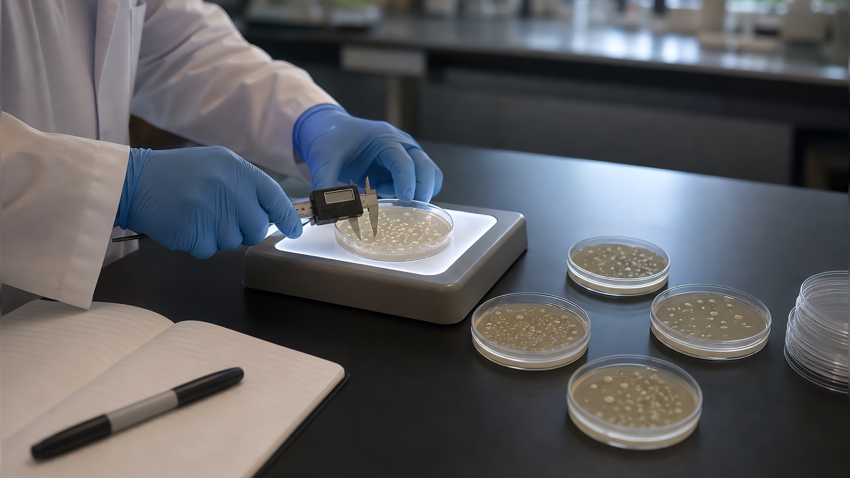
Twelve colony diameters, in millimetres, measured from one plate:
12, 14, 15, 16, 18, 19, 21, 22, 24, 26, 29, 40
They are already sorted, which is where every box plot starts. With n = 12 the median falls between the sixth and seventh values, so it is (19 + 21) / 2 = 20. Every method discussed in this article agrees on that number. The disagreement starts one step later.
Using the default in ggplot2, matplotlib and NumPy — linear interpolation between order statistics, called type 7 — the first quartile is 15.75 and the third is 24.5. The interquartile range is the distance between them:
IQR = 24.5 − 15.75 = 8.75
Tukey’s rule places a fence 1.5 IQRs beyond each hinge of the box:
lower fence = 15.75 − 1.5 × 8.75 = 2.625
upper fence = 24.5 + 1.5 × 8.75 = 37.625
The single most common misreading of a box plot happens here. The whiskers do not extend to the fences. They extend to the most extreme observation that is still inside them, which R’s documentation states plainly: the whiskers reach “the most extreme data point which is no more than range times the interquartile range from the box”. In this dataset the largest value below 37.625 is 29, so the upper whisker stops at 29. The smallest value above 2.625 is 12, so the lower whisker stops at 12. The 40 sits outside the fence and is drawn as its own point.
This is also why a box plot is not a five-number summary, although the two are routinely described as the same thing. The five-number summary of this dataset runs from 12 to 40. The figure runs from 12 to 29 with a point at 40. Both descriptions are correct and they are not interchangeable, because one of them is making a claim about which observations are typical.
Why Excel, R and SPSS give different quartiles for the same data
The median of a sample is unambiguous. Quartiles are not, because a quartile of twelve observations falls between two of them and there is more than one defensible way to interpolate.
Hyndman and Fan surveyed the problem in The American Statistician in 1996 and found the situation worse than a disagreement between packages. Their abstract is worth quoting exactly, because it describes something most users never suspect:
Often within the same package one definition will be used to compute a quantile explicitly while other definitions may be used when producing a boxplot, a probability plot or a QQ-plot.
R is the clearest case. Its quantile() function implements all nine
definitions from that paper and defaults to type 7. Its boxplot() function
does not call quantile() at all — it calls boxplot.stats(), which computes
Tukey’s hinges, and the documentation is explicit that “the hinges equal the
quartiles for odd n and differ for even n”. ggplot2’s geom_boxplot() takes a
third route: it exposes a quantile.type argument that defaults to 7. So base
R and ggplot2, in the same session, on the same vector, draw two different
boxes whenever n is even.
Excel adds its own axis of variation. Its Box and Whisker chart has a
Quartile Calculation setting under Format Data Series with two options,
which Microsoft’s support page describes as inclusive median — “the median is
included in the calculation if N is odd” — and exclusive median. The inclusive
method corresponds to QUARTILE.INC and to type 7; the exclusive method
corresponds to QUARTILE.EXC, which Microsoft documents as being “based on
percentile values from 0 to 1, exclusive”, and which R’s documentation
identifies as type 6, the definition used by Minitab and SPSS. Microsoft’s page
does not state which of the two the chart applies by default, so on an
unfamiliar machine the only reliable move is to open the setting and look.
Here is what those three choices do to the same twelve colonies.
| Quartile method | Where it is the default | Q1 | Q3 | IQR | Upper fence | Whisker top | Drawn as an outlier |
|---|---|---|---|---|---|---|---|
| Type 7, linear interpolation | ggplot2, matplotlib, NumPy, Excel QUARTILE.INC | 15.75 | 24.5 | 8.75 | 37.625 | 29 | 40 |
| Tukey hinges | base R boxplot() and fivenum() | 15.5 | 25 | 9.5 | 39.25 | 29 | 40 |
| Type 6 | Minitab, SPSS, Excel QUARTILE.EXC | 15.25 | 25.5 | 10.25 | 40.875 | 40 | none |
The box edges move by a quarter of a millimetre in each direction, which nobody would notice on a printed figure. The consequence is not subtle at all. Under type 7 and under Tukey hinges, the 40 mm colony is drawn as a lone point above the whisker and the figure says one plate behaved anomalously. Under type 6 it sits inside the whisker and the figure says nothing unusual happened. Same plate, same twelve measurements, opposite readings — and the caption in both cases would say “box plot”.
Hyndman and Fan closed their paper by recommending the median-unbiased estimator, which R implements as type 8 and R’s own documentation notes they recommended. No mainstream package uses it as its default. This is not a scandal so much as a fact to design around: the definitions differ by less than the measurement error in most experiments, and they differ by more than enough to flip an outlier verdict. Pick one, apply it to every panel in a paper, and write it down.
Three whisker conventions, and how to tell which one you are looking at
Quartiles are the disagreement you cannot see. Whiskers are the one you can, if you know what to look for.
Tukey’s 1.5 × IQR rule is the default almost everywhere: range = 1.5 in R’s
boxplot(), coef = 1.5 in geom_boxplot(), whis = 1.5 in both
matplotlib.pyplot.boxplot and seaborn.boxplot. It is common enough that
readers assume it, which is exactly what makes the alternatives dangerous.
The NIST/SEMATECH handbook documents a second convention as the basic form of
the chart: “draw a line from the lower quartile to the minimum point and
another line from the upper quartile to the maximum point”, with the 1.5 × IQR
version presented afterwards as a variation that “more specifically identifies
outliers”. Whiskers drawn to the extremes cannot show an outlier, because every
observation is inside a whisker by construction. matplotlib reproduces this
with whis=(0, 100).
The third convention replaces the rule with fixed percentiles. Both matplotlib
and seaborn accept a pair of numbers in place of the multiplier — whis=(5, 95)
draws the whiskers at the 5th and 95th percentiles and plots everything beyond
them as points. This is common in large-sample fields where the Tukey rule
would flag hundreds of observations.
Two reliable tells when reading someone else’s figure. If individual points are drawn beyond the whiskers, the whiskers are not minimum-to-maximum. If no points are drawn anywhere in a figure with hundreds of observations per group, either the data are remarkably well behaved or the whiskers are reaching the extremes. Beyond that, there is no way to recover the convention from the image, which is the argument for the legend rules in the next section but one.
Two further variants are worth recognising. NIST defines a second pair of
fences at 3.0 × IQR and distinguishes points between the inner and outer fences
from those beyond, drawing them as small and large circles — on this dataset
the outer fences fall at −10.5 and 50.75, so the 40 is a mild outlier rather
than an extreme one. And a notched box plot marks a confidence interval around
the median, extending ±1.58 × IQR/√n, a calculation R’s documentation traces to
McGill, Tukey and Larsen (1978). On our twelve values that is
±1.58 × 8.75 / √12 = ±3.99, so the notch would run from 16.01 to 23.99 — inside
the box, which is the condition Krzywinski and Altman set for showing one at
all. R’s boxplot() documentation gives the reason notches are worth the
trouble: if the notches of two boxes do not overlap, that is “strong evidence”
the two medians differ.
Reading skew, spread and outliers from the box
A box plot answers four questions, and it is worth being deliberate about reading them in order rather than forming an impression from the overall shape.
Where is the centre? The median line, at 20. Not the mean — the mean of these twelve values is 21.33, pulled 1.33 above the median by the single 40. That gap between mean and median is itself the diagnostic: on a symmetric sample they coincide, and the size of the difference measures how much one tail is doing.
How wide is the middle half? The box, 15.75 to 24.5. Half the plates fall in a range of 8.75 mm. This is the number to compare across groups when the question is consistency rather than level.
Is the sample skewed, and where? Two separate readings. Inside the box, the median sits 4.25 above Q1 and 4.5 below Q3 — near enough to centred that the central half is roughly symmetric. Outside it, the lower whisker runs 3.75 mm down and the upper one runs 4.5 mm up with an additional point 15.5 mm beyond that. The skew in this sample lives entirely in the upper tail. A box plot whose median hugs one end of the box is telling a different story from one whose whiskers are lopsided, and collapsing both into “skewed” loses the part that matters.
Which observations are unusual? Only the points drawn separately, and only under the convention in force. “Outlier” in a box plot is a statement about distance from the box, not about the measurement being wrong. A 40 mm colony on a plate of 12 to 29 mm colonies is worth a second look at the plate; it is not evidence of a pipetting error, and a figure cannot make that distinction for you.
What the box plot cannot answer is what the distribution looks like. Two clusters at 14 and 26 with nothing between them produce the same five numbers as an even spread across the same range, and therefore the same box. If the shape is the finding, the box plot is the wrong figure and a histogram, a violin plot or the points themselves are the ones that answer the question.
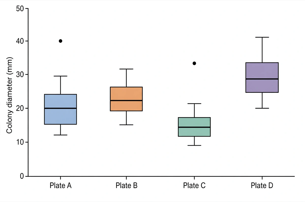
What a journal figure legend has to state about a box plot
Nature’s formatting guide contains one sentence that settles this: “All error bars and statistics must be defined in the figure legend.” A box plot is a statistic — five of them, plus a rule for classifying points — so the requirement applies in full. The same guide caps legends at fewer than 300 words and gives Nature’s standard figure widths as 90 mm for a single column and 180 mm for a double column, with 170 mm the full depth of the page.
What that means in practice is four items, none of which can be recovered from the image:
- What the box bounds are. “25th to 75th percentile” is unambiguous; “the quartiles” is not, given the previous two sections.
- What the centre line is. Median in almost every case, but some fields draw the mean, and a reader cannot tell them apart.
- What the whiskers reach. The rule, not a description: “1.5 × IQR”, “minimum to maximum”, “5th and 95th percentiles”.
- n per group. A box drawn from six observations and a box drawn from six hundred look identical and mean very different things.
A legend that does the job reads about like this: Box: 25th–75th percentile; centre line: median; whiskers: most extreme value within 1.5 × IQR of the box; points: observations beyond the whiskers; n = 12 colonies per plate. Thirty words, inside any journal’s budget.
Being precise about the sourcing here: no journal whose author guidelines could be reached publishes a box-plot-specific legend template. Nature’s formatting guide and Nature Portfolio’s reporting standards state the general requirement above; PLOS ONE’s figure guidelines cover captions and file preparation without addressing plot conventions; PeerJ’s policies recommend that authors “overlay bar graphs with scatter plots showing individual data points, or use another method to show the distribution of the data, such as boxplots, violin plots”, which is advice about figure choice rather than about legends. Cell Press, the Journal of Cell Biology and the American Physiological Society all refused automated access to their author pages, so their policies are not represented here. The absence of a specific rule is the reason box plot legends vary as much as they do in print, and it is why the four-item list above is a working standard rather than a citation.
The rest of the figure follows the same specifications as any other panel — resolution, fonts, line weights and file format — and those are set per journal. Our guide to making scientific figures covers the general craft, and the Scientific Reports figure requirements page works through one journal’s numbers in full.
When a box plot hides your data
The box plot’s reputation as the responsible alternative to a bar chart is deserved, and it has a limit that is easy to cross without noticing.
Weissgerber and colleagues reviewed 703 full-length research articles published in the top quartile of physiology journals between January and March 2014 and counted what the figures actually showed. 85.6% of papers contained at least one bar graph. Only 5.3% contained a box plot; 13.4% contained a univariate scatterplot and 8.0% a histogram. The bar graph is still the default, and the box plot is rarer than either of the alternatives it is usually recommended over.
The same review measured the sample sizes behind those figures, and this is the number that constrains the box plot. The smallest group shown in a figure had a median of four independent observations, with an interquartile range of three — in 75% of papers, the smallest group in any figure was between two and six observations. The authors’ conclusion is direct: summary statistics shown in bar graphs, line graphs and box plots “are only meaningful when there are enough data to summarize”, and univariate scatterplots are the better choice for those studies because box plots and histograms “would be difficult to interpret”.
Krzywinski and Altman set a specific floor in Nature Methods, advising that box plots “should be avoided for very small samples (n < 5)”. Between five and roughly ten observations per group, a box plot is defensible but a strip of the actual points alongside it is better, and costs nothing. Above that, the box starts earning its keep — and the more groups a figure compares, the more it earns, because twelve boxes fit in a panel where twelve histograms do not.
The rule that falls out of this is not “use box plots”. It is: show the distribution when you can, summarise it when you must, and let n decide which. Under about ten per group, plot the points. Over it, plot the box and consider overlaying the points anyway.
Frequently asked questions
Why does my box plot look different in Excel and in R? Because they do not
compute the quartiles the same way. Excel’s Box and Whisker chart offers a
Quartile Calculation option with an inclusive-median and an exclusive-median
method; base R’s boxplot() uses Tukey hinges; ggplot2 uses the type 7 sample
quantile. On the twelve values 12, 14, 15, 16, 18, 19, 21, 22, 24, 26, 29, 40
those three put Q3 at 25, 24.5 and 25.5 respectively, which moves the upper
fence from 39.25 to 37.625 to 40.875 — and decides whether the 40 is drawn as
an outlier.
What is the difference between a five-number summary and a box plot? A five-number summary is the minimum, first quartile, median, third quartile and maximum. A Tukey box plot draws the quartiles and the median, but its whiskers stop at the last observation inside the 1.5 × IQR fences rather than at the minimum and maximum. In the worked example the summary ends at 40 while the upper whisker ends at 29, because the 40 is plotted as its own point.
Should the whiskers go to the minimum and maximum? Only if you say so. The
NIST/SEMATECH handbook defines the basic box plot with whiskers drawn to the
minimum and maximum, and matplotlib reproduces it with whis=(0, 100). It is a
legitimate convention, but it cannot show outliers by construction — every
point falls inside a whisker — so a reader who assumes the Tukey default will
misread the figure.
What does a notch on a box plot mean? It is a confidence interval around the median, extending ±1.58 × IQR/√n. R’s documentation attributes the calculation to McGill, Tukey and Larsen (1978) and states that if the notches of two boxes do not overlap this is strong evidence that the two medians differ. Krzywinski and Altman recommend showing notches only when they fall within the interquartile range; when the notch runs past the hinges, R draws it inside out and warns.
How many data points do you need for a box plot? Krzywinski and Altman advise against box plots for very small samples, using n < 5 as the threshold. Weissgerber and colleagues go further for typical laboratory sample sizes: in their review of 703 physiology papers the smallest group shown in a figure had a median of 4 observations, and they recommend univariate scatterplots for those studies because a box plot summarises data that are not numerous enough to summarise.
What should a box plot figure legend say? Nature’s formatting guide requires that all error bars and statistics be defined in the figure legend. For a box plot that means four things: what the box bounds are, what the centre line is, what the whiskers reach, and n per group. A legend that says “box: 25th–75th percentile; centre line: median; whiskers: 1.5 × IQR; points: values beyond the whiskers; n = 12 colonies per plate” leaves nothing for the reader to guess.
Can a box plot show a bimodal distribution? No. The box plot draws five numbers, and two clusters with a gap between them produce the same quartiles as an even spread across the same range. If the shape of the distribution is the finding, a histogram, a violin plot or the raw points will show it and a box plot will not.
Is the median always in the middle of the box? No, and where it sits is the fastest read on skew in the middle half of the data. In the worked example the median at 20 lies 4.25 above Q1 and 4.5 below Q3, so the central 50% is close to symmetric — while the tail above the box is long enough to throw one value past the fence. Skew in the box and skew in the tails are separate readings.
Where to go next
The conventions here are one figure type’s worth of a larger problem: every element of a published figure is a claim that a reader has to be able to decode. Our guide to making scientific figures covers the parts that apply to all of them — resolution, type sizes, line weights and the reduction test that decides whether a 5 pt label survives the printer.
If the data behind the box came off a microplate, the 96-well plate format guide traces every dimension of the plate to the ANSI/SLAS standards, including the four that no standard specifies and that vary between suppliers.
And when the numbers are ready, the box plot maker computes the quartiles, whiskers and outliers from your file before drawing anything, so the figure and the legend can state the same thing.
References
- quantile — R documentation of the nine sample quantile types — The R Project for Statistical Computinghttps://stat.ethz.ch/R-manual/R-devel/library/stats/html/quantile.htmlAccessed Sep 1, 2026
- boxplot.stats — Box Plot Statistics — The R Project for Statistical Computinghttps://stat.ethz.ch/R-manual/R-devel/library/grDevices/html/boxplot.stats.htmlAccessed Sep 1, 2026
- boxplot — Box Plots — The R Project for Statistical Computinghttps://stat.ethz.ch/R-manual/R-devel/library/graphics/html/boxplot.htmlAccessed Sep 1, 2026
- Hyndman, R. J. & Fan, Y. Sample quantiles in statistical packages — The American Statistician 50(4), 361–365 (1996)https://robjhyndman.com/publications/quantiles/Accessed Sep 1, 2026
- geom_boxplot — A box and whiskers plot (in the style of Tukey) — ggplot2 referencehttps://ggplot2.tidyverse.org/reference/geom_boxplot.htmlAccessed Sep 1, 2026
- matplotlib.pyplot.boxplot — Matplotlib documentationhttps://matplotlib.org/stable/api/_as_gen/matplotlib.pyplot.boxplot.htmlAccessed Sep 1, 2026
- seaborn.boxplot — seaborn documentationhttps://seaborn.pydata.org/generated/seaborn.boxplot.htmlAccessed Sep 1, 2026
- NIST/SEMATECH e-Handbook of Statistical Methods, 1.3.3.7 Box Plot — National Institute of Standards and Technologyhttps://www.itl.nist.gov/div898/handbook/eda/section3/boxplot.htmAccessed Sep 1, 2026
- Create a box and whisker chart — Microsoft Supporthttps://support.microsoft.com/en-us/office/create-a-box-and-whisker-chart-62f4219f-db4b-4754-aca8-4743f6190f0dAccessed Sep 1, 2026
- QUARTILE.EXC function — Microsoft Supporthttps://support.microsoft.com/en-us/office/quartile-exc-function-5a355b7a-840b-4a01-b0f1-f538c2864cadAccessed Sep 1, 2026
- Krzywinski, M. & Altman, N. Visualizing samples with box plots (Points of Significance) — Nature Methods 11, 119–120 (2014)https://www.nature.com/articles/nmeth.2813Accessed Sep 1, 2026
- Weissgerber, T. L. et al. Beyond bar and line graphs: time for a new data presentation paradigm — PLOS Biology 13(4), e1002128 (2015)https://journals.plos.org/plosbiology/article?id=10.1371/journal.pbio.1002128Accessed Sep 1, 2026
- Formatting guide — figure legends and figure sizes — Naturehttps://www.nature.com/nature/for-authors/formatting-guideAccessed Sep 1, 2026
- Policies and Procedures — data presentation — PeerJhttps://peerj.com/about/policies-and-procedures/Accessed Sep 1, 2026
Journal, conference and product names are the trademarks of their respective owners. This page is independent editorial content and is not affiliated with, authorised by, or endorsed by them. Specifications change — confirm every requirement against the official sources linked above before you submit or print.